Interactive slice viewer
Scroll through the brain and see, at every coronal level, the projections that multiple source regions send into a target region — each source drawn in its own colour — together with the injection sites that produced them.
plot_upstream_projectome opens a Jupyter widget with an anterior-posterior (AP)
slider. At each slice it overlays, on the Allen CCF structure boundaries:
a per-source-region coloured heatmap of projection density inside the target region (intensity ∝ density, colour = source region), and
injection-site dots (sized by injection volume) at the AP levels where the injections actually sit.
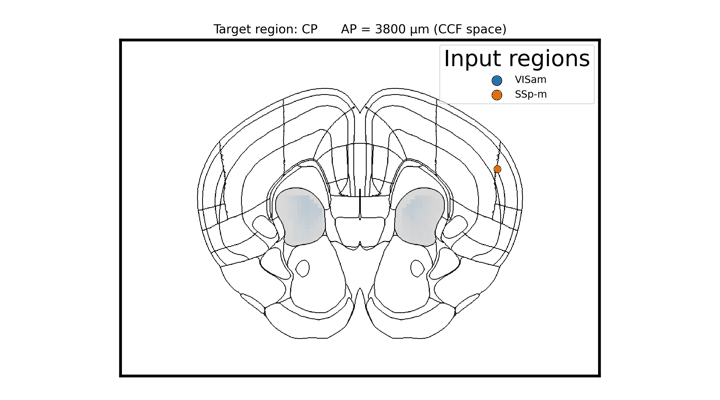
Scrolling through coronal slices: projections into the caudate putamen (CP) from four visual areas, each in its own colour. In the live widget an anterior-posterior slider drives this; injection-site dots appear at their own (more posterior) AP levels.
Python:
import bsv

# Find experiments injected in the chosen source regions
source_regions = ['VISam', 'SSp-m']
experiment_ids = bsv.find_connectivity_experiments(source_regions)

# Launch the interactive AP-slider viewer (in a Jupyter notebook)
bsv.plot_upstream_projectome(
    experiment_ids=experiment_ids,
    source_regions=source_regions,   # one colour per region
    target_region='CP',              # region whose incoming projections are shown
    save_location='/path/to/cache',
    allen_atlas_path='/path/to/allenCCF')
To render a single slice as a static figure (e.g. for a paper) instead of the widget,
pass static_ap (a 100 µm AP index) and optionally save_path:
bsv.plot_upstream_projectome(
    experiment_ids, source_regions, 'CP', save_location, allen_atlas_path,
    static_ap=55, save_path='projectome_CP_ap55.svg')
Source regions can also be discovered automatically with
bsv.fetch_upstream_regions() (which finds every region projecting to the target)
before choosing a subset to display.